The median conversion rate in 2021 for SaaS businesses is 3% and for business services 3.5%, according to Unbounce’s 2021 Conversion Benchmark Report.
Not bad, but not great either, right?
So what makes for these rather low conversion rates? Marketers still struggle to build and optimize landing pages to perform well. Part of the problem is that there is no silver bullet solution or structure for the perfect landing page. It’s a combination between best practices and principles to follow and continuous testing and tweaking.
And this is exactly what we want to do in this article, show 5 key principles to start from when building high-converting landing pages.
We’ve also talked about these principles in a past webinar, you can find the recording here (content in Romanian). So let’s get started.
Why do you need a landing page?
“Never start a marketing campaign without a dedicated landing page” is a saying that goes around in the marketing world.
And the reason for that is landing pages are dedicated web pages designed to achieve one single goal: whether that is to sign up for a product demo, free trial, free consultation session, or download a resource.
When you direct your visitors’ focus to one action they can take, the chances of conversion increase. If you put effort (and most of the time a little bit of advertising money) to bring target traffic to a webpage, there is no value in showing them several Calls-to-action. You want to keep them focused on one core goal.
On the opposite spectrum, other website pages such as the homepage are built for discovery (you want people to learn more about your offering, team, process, clients, etc) so there are multiple goals to be achieved.
We call this attention ratio: when the focus splits across 10 goals, the attention ratio is 1:10 versus when the focus is on one single goal.
Here is how a homepage looks in comparison to a campaign landing page – the latter features one single Call-to-action, hence one single goal.


What are some common use cases for landing pages?
You can use landing pages to accomplish different goals:
- Generate leads: you are trying to convert qualified traffic on an offer, whether that offer is an eBook, a webinar, demos of your product, or free consultations
- Drive product signups: you can use a dedicated landing page for people in the decision phase to get them to sign up for your product
- Sell products: you have a product that needs explaining so you’re warming up your audience before asking them to buy
- Test new products or services: if you’re launching a new service or package, a landing page can help you understand if there is a demand for it and how people receive it
- Test your value proposition and key messaging: if you are refining your value proposition and core messaging, landing pages can help you understand how your target audience responds to different copy and what resonates. It helps you make informed decisions instead of guessing.
Key elements of your landing pages
There are no silver bullet recipes for high converting landing pages, but there are a few foundational elements that you need to have. Without them, the landing page will lack clarity and cohesion, and not convince people to take the intended action. So it’s good to first know the rules, so you can then break them effectively.
1. A clear value proposition
The value proposition simply answers the question “what’s in it for me?” for your visitors. Whoever lands on your landing page should be able to grasp in a few seconds the value of your offering. Research shows you have around 5 seconds to get their attention, otherwise they’ll bounce off never to return again.
A common mistake we see is marketers tend to write value propositions that sound clever but lack clarity.
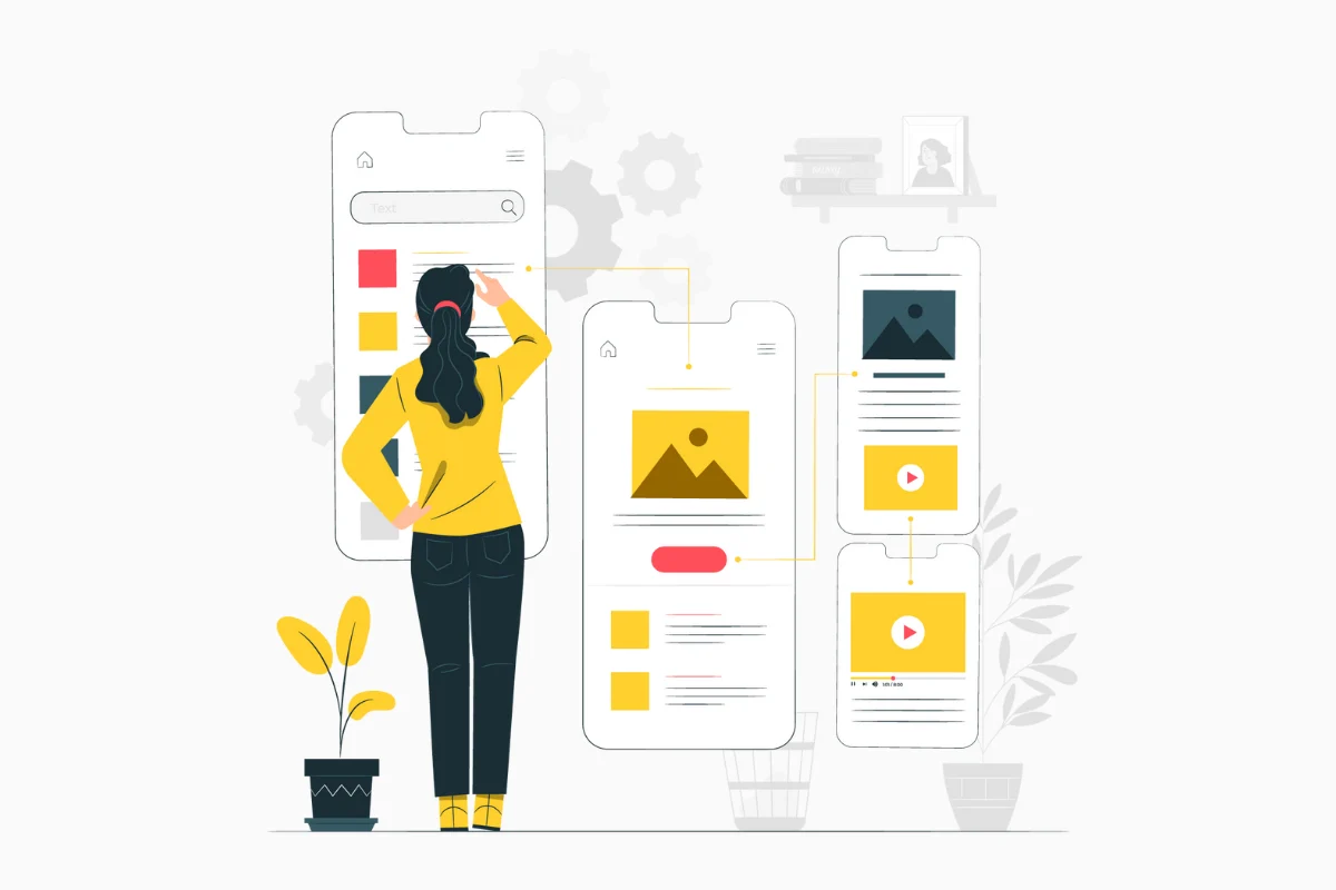
2. Your hero image or video
We are visual human beings, so use images and videos to offer people a snapshot of your landing page offering. If it’s an eBook create a mock-up and put it in the banner, if it’s a product sign up use product screens.
3. Benefits
Benefits are ways in which your offering makes your audience’s life better if they decide to claim the offer. But be aware that benefits are not features – it’s not what your product can do, but what your audience wins when they use it. Benefits sell, features support.
How many benefits should you add? We would say that 3-4 are enough, if you add too many you risk diluting their power, and too few can look unconvincing.
4. The Call-to-Action
Your call to action tells people what you want them to do, keep it simple and clear.
5. Social proof
Your audience is seeking to confirm the choice before hitting the Sign up/Download button. So social proof plays an important role in alleviating “buyer’s remorse”. Invest in testimonials and other social proof examples.

5 good practices for a successful Landing Page
1. Communicate your value proposition
Clever messages can easily become confusing for people who are new to your brand and offering and that will make them leave the website. Instead, a simple message that emphasizes what they’ll get from signing up for your offer, might do the trick.

You can communicate this value proposition through these elements:
- Headline: it should shortly answer these questions: why is your offer better/different? What will they gain from using it?
- Supporting headline: this piece of copy complements or supports the headline message and sits below it. For someone who’s reading only this text, it should still be clear what the offer is about.
- Reinforcing statement: if your Landing Page is long and people have to scroll through it, they might lose sight of the value proposition. Use reinforcing statements to remind them about it, but make sure to add some new information – what have your visitors learned since they entered the site and until they reached this statement?
- Closing statement: this is your last occasion to have people do what you want them to do. Use a statement at the end of the page and remind them why it’s to their advantage to take action now.
Here’s what ActiveCampaign uses as a closing statement.

Headlines are a very important element. We should spend 50% of time writing headlines and 50% writing the CTA.
Every piece of content you write on your landing page should be understandable by your target audience. Simply put, you should write in their own “language” and to do that, you should:
- Do your research. Interview your clients. Actually talk to them, find out what made them buy from you or what almost prevented them from buying. Check what they say about your product/service on social media, on forums, on your company’s chat.
- Conduct an analysis. It’s important to understand not only our client’s most common problems or challenges, but also to learn how they talk about these issues. What words do they tend to use the most? It’s extremely efficient to use their own words, as the content will instantly become more relatable
- Write at least 5 headlines to reach the one that’s good enough for your website and audience
- Test – try this: send your landing page to a friend or to someone who isn’t familiar with your product. Are 5 seconds enough for them to understand what the offer is about? Another option is Usability Hub, a platform that provides testers for this purpose specifically
2. Tell people what you want them to do
“On your Landing Pages, the Call-to-action represents the tipping point between bounce and conversion” – Michael Aagaard, Conversion Optimization Veteran

Your Call-to-action button can make or break the deal. So when you are building it, pay attention to:
- The copy: use a clear, direct message. Tell people what they should do: download now, register, ask for a demo, get your eBook. Too vague messages (click here) generally show poor results.
- The design: make it visible! Your landing page visitors should see the CTA button, so use a distinctive colour, shades to add depth, use arrows to direct their attention
- CTA button location on the page: a simple rule is to place your call-to-action button above the fold. People should see your value proposition, the benefits and then the CTA button. Rules change when it comes to more complex offerings or products that require more complex decisions. In these cases, leads are not ready to take action that fast, so it helps to explain the product, to create awareness and motivation and only then display a CTA button.
3. Communicate the benefits
What problem do you solve? How do you help your clients? Do you save them time, money, effort, do you help them sell more? Again, think about actual advantages and not features.
How can you identify these benefits? There are various ways to help you understand what made your clients buy from you: interviews, social media research, your competition’s websites (check out their testimonials, they’ll show how their product improves their clients’ lives).
4. People want to be reassured they are making a good decision
People are more likely to buy/sign up if they see others have done as well. They need confirmation that their decision is the right one and you can enforce this feeling by using testimonials, case studies, video testimonials, client lists, or online reviews.
To take your testimonials a step further and make them super effective, consider:
- Putting them in context: locate a testimonial next to a benefit if related to that benefit.

- Addressing a pain point: a lot of product testimonials are just empty words “such a great product, made my life easy, love it!”. Their real power lies in showing how a customer solved their problem using your solution.

- Borrowing authority: if your business is in an early stage and don’t have clients just yet, you can use an industry opinion leader’s thoughts on a relevant point to support the importance of your products/services.
5. The journey doesn’t end after conversion
Before launching a Landing Page, it’s best to have a post-conversion strategy. What happens with those leads after they are converted? They’ll probably get on a thank you page, that you can further use for upsell or you can include them in an email nurturing process. The journey doesn’t stop here, this is only the beginning.
What to know before hitting publish on the landing page
So you’ve added all the key elements to your landing page, your visuals and copy look great and you’re ready to hit the publish button.
Before you do that, here are 5 questions to ask:
- Is my offer and value proposition clear enough? What might be obvious to you may sound totally confusing to someone who doesn’t know your brand and business. Test by asking friends or use a tool such as Usability Hub.
- Is my page relevant for people landing on it? Consider where your traffic is coming from (an ad, your blog or your database) and check if there is a message fit between the Call to action that got them there and the actual offer on the page.
- Am I providing enough information to get people to act? Consider what questions your audience might have prior to converting (eg. what do they need to know about your product before signing up for a free trial?) and put it on the landing page.
- Do people have enough reason to trust my offer? Can people find enough social proof on your landing page to convince them to act?
- What is the unique benefit of my offer and have I made it obvious? You want to show people why your offering is better and what they stand to win by claiming it.
Once your landing page is live, track how people interact with it by using tools such as Hotjar to see where they click, how deep they scroll, and then based on those observations, test and make one change at a time.
I’d love to hear if you’ve tried these ideas and if they’ve worked for you. If you want to explore some more Landing Page related content, check out this article.