Building conversion-driven homepages
written by
Elena Iordache
date
06 September 2020
Are you 100% satisfied with how your website is performing? Do your visitors stick around for longer and navigate several pages or do they bounce off most often than not? Do you get enough qualified leads or do you feel you could do better?
If you find yourself in the second scenario and are considering making some changes, perhaps it’s a good opportunity to look at how you can optimize your homepage.
For most websites, the homepage is by far the most visited page and the experience you create there keeps visitors browsing or can, on the contrary, turn them away.
The purpose of your homepage is to briefly answer a few important questions such as:
and invite visitors to discover more information on other webpages.
You can provide answers to these questions using a few different elements, and we’ll talk about each of those and then show you some homepage examples we like and what you can learn from them.
Once a visitor has landed on your website, you have a very short window of opportunity to tell her what is that you do and how that can be interesting for her. 15 seconds to be more precise.
The best way to do that is through a concise headline followed by a sub-head that adds more details and reinforces the headline.
The headline and sub-head should capture in what way your product or service helps solve a major challenge or pain point of your main buyer persona.
Conveying how your offering helps someone solve a problem is a sure way to get their attention, as opposed to boasting about your product or service.
The next thing you want to do, after telling visitors what problems your business can solve for them, is to invite them to take some form of action or next step. Depending on your persona and the specifics of your buying process, you can invite them to learn more about your approach, to sign up for a demo or trial. You should be cautious about jumping straight to the point and asking visitors to buy or get in touch with a sales person. For almost 96% of people landing for the first time on your website, it is just too soon.
Moqups displays an on-point headline on their website “Shape your Ideas. Prove your concept.” followed by a detailed sub-head that explains how their web-based app solves one of their targeted audience’s issues, creating and collaborating on wireframes, mock-ups and prototypes. They then invite visitors to create a free account and try the app themselves.

You will want to make it easy for people to understand what are the core services you provide. If you have a product, displaying key features may be a good approach.
The main takeaway is to help people visualise what you sell, you don’t want to keep them looking around.

What are the key benefits that make your customers stick with your product or service? Why should anyone buy from you, how will you make their life easier or better?
People are interested in learning the benefits of a service or a product, the “what’s in it for me?”.
Therefore make sure to list the key benefits, those things that keep your current customers happy.
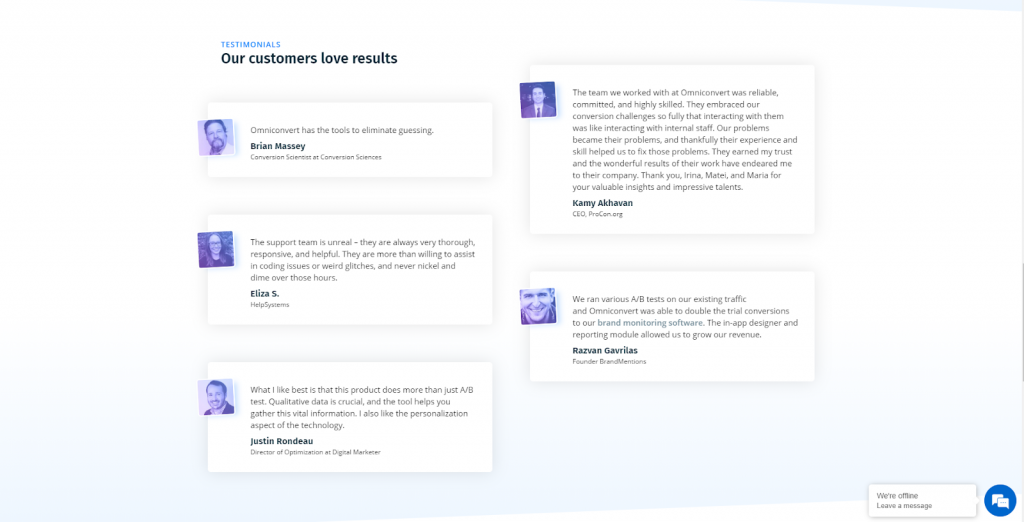
Social proof is a major trust builder and trust is an important factor in making purchasing decisions. Online reviews and testimonials weigh heavily when deciding to buy a certain service or product, with as much as 70% trusting peer reviews, according to Nielsen research.
So make sure that you display a list of customers you work with, and add testimonials accompanied by their name and picture. Video testimonials have an even bigger impact, so add those if you have them.

Did you receive an important industry award, were featured in a major publication or reached an important company milestone?
List out your achievements and let visitors know of your success.

An image is worth a thousand words, and this holds true when it comes to your website as well. Make sure to feature a hero image that clearly gives an indication of what you offer.
Flow chose to feature their main product on their homepage, so you instantly find out what their business has to offer.

Remember that as little as 2-4% of your visitors are ready to buy when they land on your website and so the goal of your homepage is to earn their trust and to move them to the next step. So providing them with additional content in the form of links to your most recent / most popular blog articles or an invitation to access a content offer can help you achieve just that.
Before you start thinking about the messaging and the design of your homepage, your first task is to research your buyer persona and understand their challenges, pain points and motivations, as well as what is that they are trying to achieve.
With these insights in mind, building a wireframe for the homepage and then a design will come easily.

Omniconvert has a direct headline and sub-head that nods to the main goal accomplished by their technology – help eCommerce companies grow using data. They feature a product video explaining how their technology works and display two Calls-to-action, a main one above the fold “Let’s talk” and a second one below the fold “Book a demo”. They don’t directly push for a sale, but rather schedule a meeting or call with their potential clients.
Omniconvert incorporated customer testimonials and displayed selected customers and bits of achievement as a means of earning their visitors’ trust.

What we love about their website is the clean, minimalistic design. The illustrations, colors and fonts they used are clean and modern. You can see upfront what the product does and scroll down to discover some of their clients and detailed product features.
The main CTA they use emphasizes the fact that they offer a free trial for their product.

Another conversion oriented action they took was to include a carousel of feedback from various clients that use their product.

For Fitbit, conversions mean more sales. Their website clearly pushes for these types of actions. Their first CTA is a pre-order button. Underneath, we can find the 3 latest products that can be pre-ordered as well.
Compared to other accessories’ website, Fitbit also includes their mission and values only one scroll away.

Moqups homepage informs you right away what their product is about and how that solve an important pain point, in their headline and sub-headline. The main CTA then invites you to create a free account.
They make a point of featuring some of their most popular clients and feature another sub-headline mid-page. Product features are then presented, followed by customers’ testimonials and another CTA inviting you to create an account.

The landing page clearly displays their mission and statement.
The CTA afterwards is simple, engaging and effective. “What can we do for you?” They show empathy and willingness to help. This button sends you to the service page where we can clearly see everything this company can do for you.

Under each of these services you can clearly see the logos of all the companies they offer these services to.
Zitec design is clear, with simple messages that clearly offer enough information.
They do not have customer feedback on their website, but they provide information about who their clients are. These clients are important market players which boost any potential customers’ trust.

One recurring theme we can see with almost every conversion oriented landing page is the clean, sleek and modern design. These types of landing pages tend to be minimalistic, with maximum 3 – 4 sentences that grasp the whole mission and purpose of the company.
Bolt did a great way with their statement “The fast, affordable way to ride.”It’s clear, concise and when you read it, you understand what they do.
They also included the “Download” buttons under the main header. Because they are looking to get more potential app users, they simply made those buttons the center of attention.

Underneath the first banner, they also push the idea of working for them as a driver. Another simple message with a clear CTA.

Another great example of white space usage to emphasize a clear message and call to action. Their homepage displays the product’s features, pricing and also company’s mission.

Similarly to Bolt, Flow pushes for App downloads straight from the main banner.
Potential customers get the main idea about the mission of the company straight from the main heading. Even though they did not include customer feedback on their landing page, they do have a FAQ section to help answer the most common questions user have about the Flow product.

What other websites would you add to this list?