How to create quick visuals using these 10 simple rules – Canva edition
written by
Emilia Negoescu
date
26 August 2021
If you are a marketer, you most likely work with a graphic / web designer or even a team of designers. Even so, you can find yourself in the situation of needing to put together a presentation or a social media visual on your own – and rely on your own “design gut”.
I wanted to write this article for situations in which time is not your friend and you want a simple and quick way to communicate ideas and showcase them.
I will present you with how to use design elements and principles to achieve a good layout for your visuals, by following these simple rules.
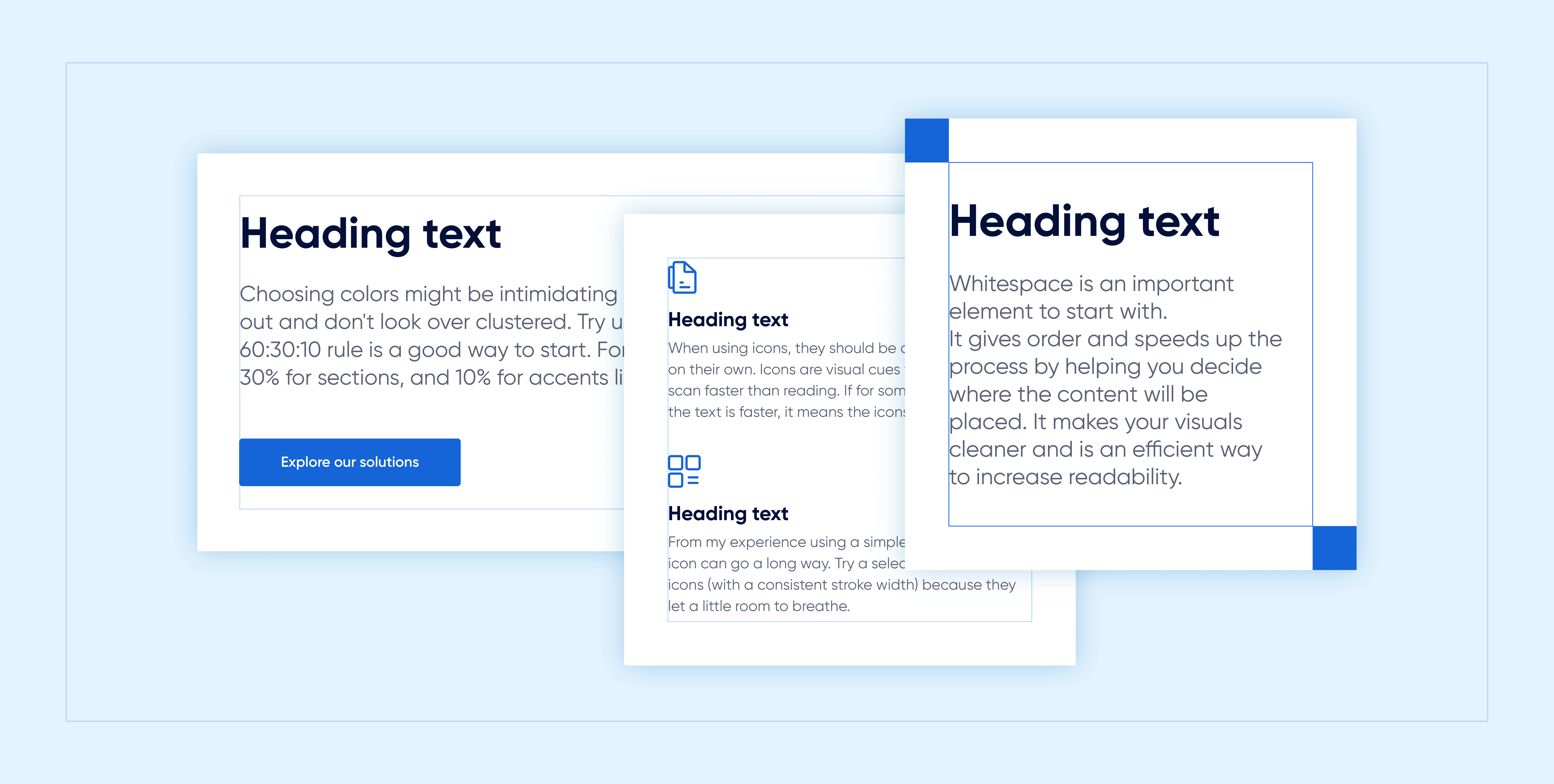
This is an important element to start with. It gives order and speeds up the process by helping you decide where the content will be placed. It makes your visuals cleaner and is an efficient way to increase readability (don’t place elements along the edge or corners of a page unless you deliberately want to cut elements off).
Depending on your visual dimensions, try to use a square to delimitate the space in which you will insert your content. For example, if you are working with 1080×1080 dimensions, try maintaining the square somewhere between 90-110px. Canva already has a built-in safe space, but if you want to do something different and have a little fun, try delimiting your own safe space.
Don’t forget: Negative space is a good thing, so let your design breathe.

Visual hierarchy influences the order in which our eyes choose to look at presented design elements and helps us create emphasis. At first, we notice the hierarchy in scale (first, you see the heading, then the text below), and then the hierarchy in color. This is why multiple times the CTA button has a crazy brighter color.

Typography has a big impact on viewers’ thoughts, feelings, and behavior.
Firstly, pick a typeface.
Typefaces can vary from communicating feelings like trust, respect, elegance (serif) to modern, clean, and minimal (san serif).
A general rule is to never use more than two typefaces: as you can see below how more than two can lack consistency and decrease readability.

If you want to play it safe, stick with one until you feel comfortable.
Advance tip: When using two typefaces, pick them so they can complement each other and are not from the same classification (for example, do not use two sans serif, serif, slab serif or script faces together. Why? It’s simple, contrast).
Here are some pairing examples: Poppins & PT Serif, Libre Baskerville & Source Sans Pro, Lato & Merriweather, Raleway & Roboto, Oswald & Montserrat, Playfair Display & Raleway, Helvetica Neue & Garamond.
Canva has hundreds of pre-set font combinations to choose from (you can find these in the Text tab in the side panel).

Secondly, set the text size.
Make your text easy to read. A good font size rule is to double or half the point size you are using. For example, if you are using 32 pt. type for the headline, use 16 pt. type for the body copy. For something more dramatic, try 3x or 4x the point size.

Thirdly, pay attention to your line spacing.
Adjusting the line height to enhance readability is a good idea. The line spacing should be around 120-140% of the font, and if we are talking about Canva, somewhere around 1.4-1.6.
Remember: Smaller font sizes require bigger line space.
When in doubt, always use left-aligned type. Why?
Centered type text might be tempting to use because it is symmetrical, but the left-aligned type is much easier to read (hence why all books and blogs are like these). The left edge creates a line that our eyes can perceive much faster and it also helps because it aligns with other objects, creating a connection as a whole.
When reading centered type, our eyes have difficulty in jumping to the next line, but with left-aligned text, our eyes know where to jump, increasing readability.

Skip a weight to create visual contrast in the text. Most typeface families offer different font sizes to choose from. Sometimes close fonts bring a small difference.
My general rule: skip a weight to create visual contrast. For example, if you use bold for the heading, try making a difference with the use of regular for the text.
Always aim for text legibility by keeping the header at full opacity or a shaded tint and the text at 80-70% or a lighter color tint.

Choosing colors might be intimidating but at the same time you want to stand out and don’t look over clustered.
Colors draw the user’s attention. When you use too many of them they become distracting. Try using monochromatic palettes.
Following the 60:30:10 rule is a good way to start. For example, try using 60% for the background, 30% for sections, and 10% for accents like buttons, fonts, etc.
Whether you want to quickly find a color palette to work with or build your own, here are some color resources that may help you: color.adobe.com/explore, coolors.co, colorhunt.co.

Always opt for open images that incorporate one focal point and have a large amount of whitespace. They create a clean and minimalist feeling and leave room for the text to breathe, increasing interest.
Photos are essential aspects of providing the right mood and professionalism of the design. The very first step is to use high-resolution images. The higher the resolution the better. Next, try to find the right photo for the specific mood and content.
Some resources where you can find free images for personal and professional use: unsplash.com, pexels.com, pixabay.com, freepik.com, shutterstock.com

When using icons, they should be able to stand out on their own. Icons are visual cues that help you scan faster than reading. If for some reason reading the text is faster, it means the icons aren’t working.
From my experience using a simple and recognizable icon can go a long way. Try a selection of outline icons because they leave a little room to breathe.
When using multiple icons, use a consistent stroke width for curves, corners (sharp or rounded), and angles (15°,30°,45°). Inconsistency isn’t good, so using icons from the same pack is a good idea. At the same time don’t use icons that are unreadable in smaller sizes.
Some free icon resources: flaticon.com, icons8.com, feathericons.com, iconscout.com, evericons.com, tablericons.com
Buttons are interactive elements used to perform a specific action, with different purposes. In this article, the main buttons that can be used in visuals are ‘’call to action’’ buttons, ghost buttons, and text links.
The purpose of the CTA (call to action) button is to encourage people to take certain actions, bringing them one step closer to conversion.
Ghost buttons typically appear blank and transparent and are bordered by a thin rectangular line. As text buttons, they are used to create an area that is not distracting the user from the main content.
Another factor that can have a big impact overall is choosing the right button radius. A 3-4px radius is probably the safest choice, expressing a friendly and professional feeling.

If you’re at the beginning, use this article to help you create brilliant visuals by following the rules above.
I know there are a lot of things to consider when putting together your design elements, but just remember: be creative and don’t be afraid to bend the rules a little. At the end of the day, graphic design is about experimenting and is ok if you want to add a little personality to your designs.
Canva has a lot of resources for you to utilize. Also, to make the process smoother, you can find below 3 templates that can help you start.
1. Promote your event
2. Share the news about an article
3. Inspire through your Instagram Stories