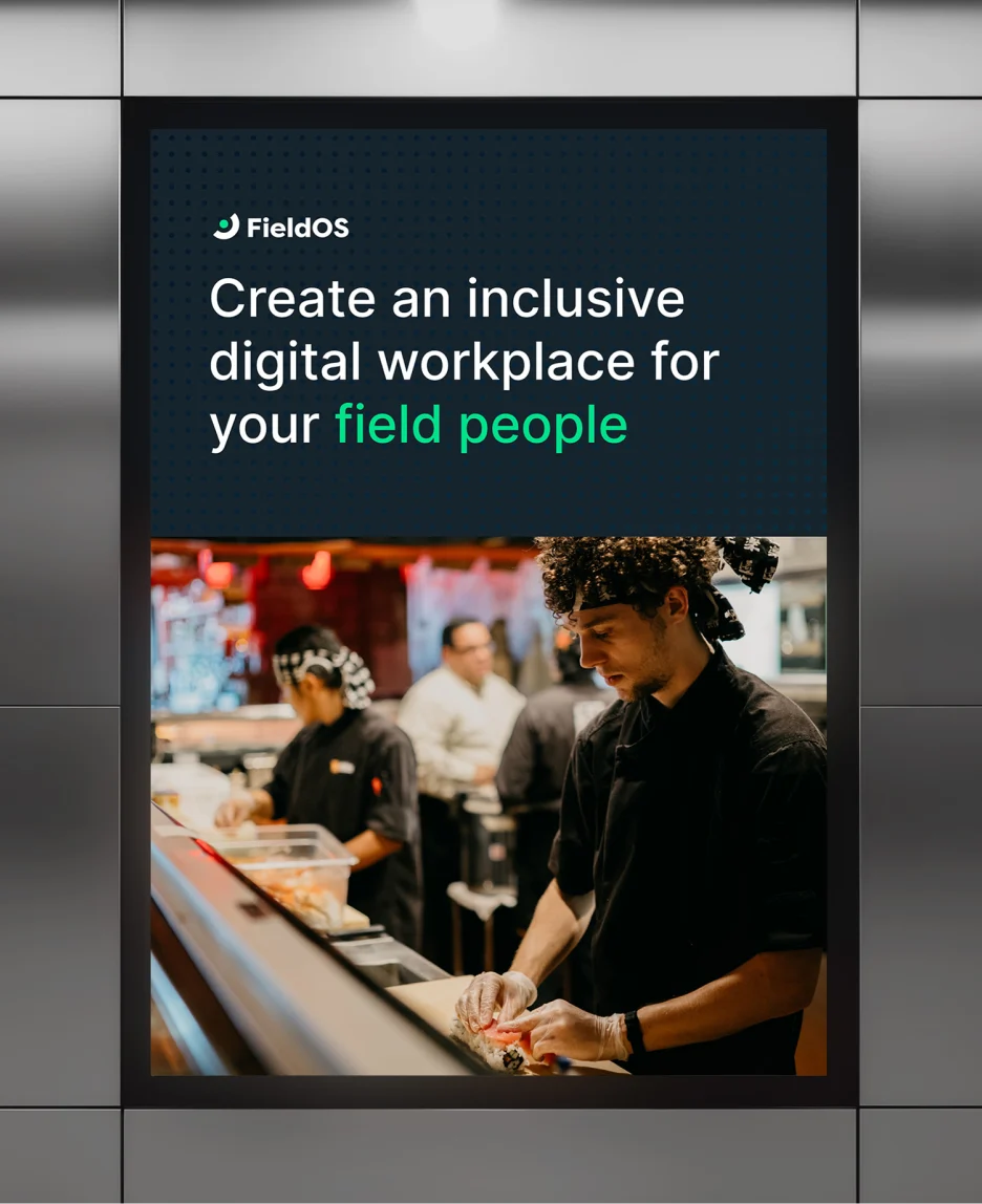
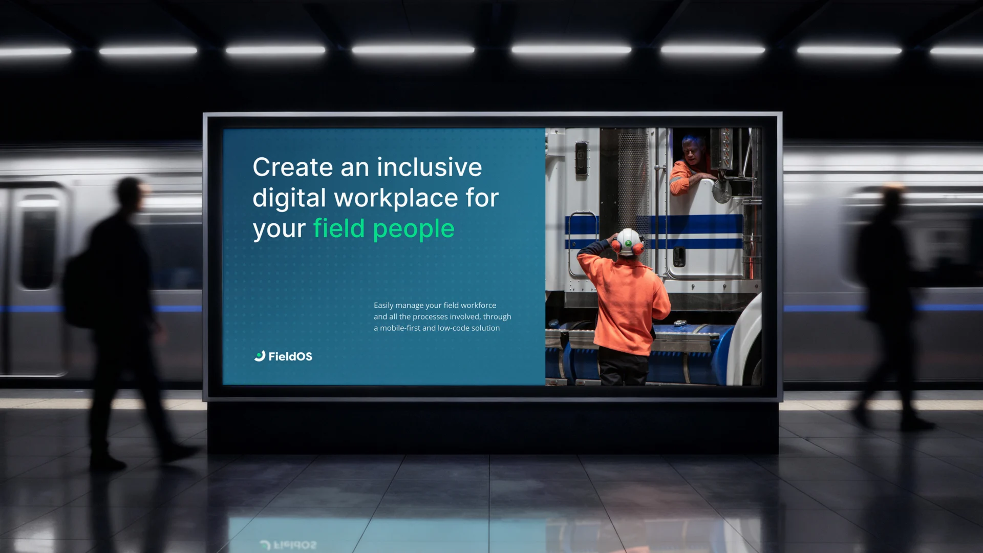
FieldOS — recently renamed from SmartHuts as the company shifted focus toward enterprise — had the product, the clients and the track record. What they needed was a brand that showed it.
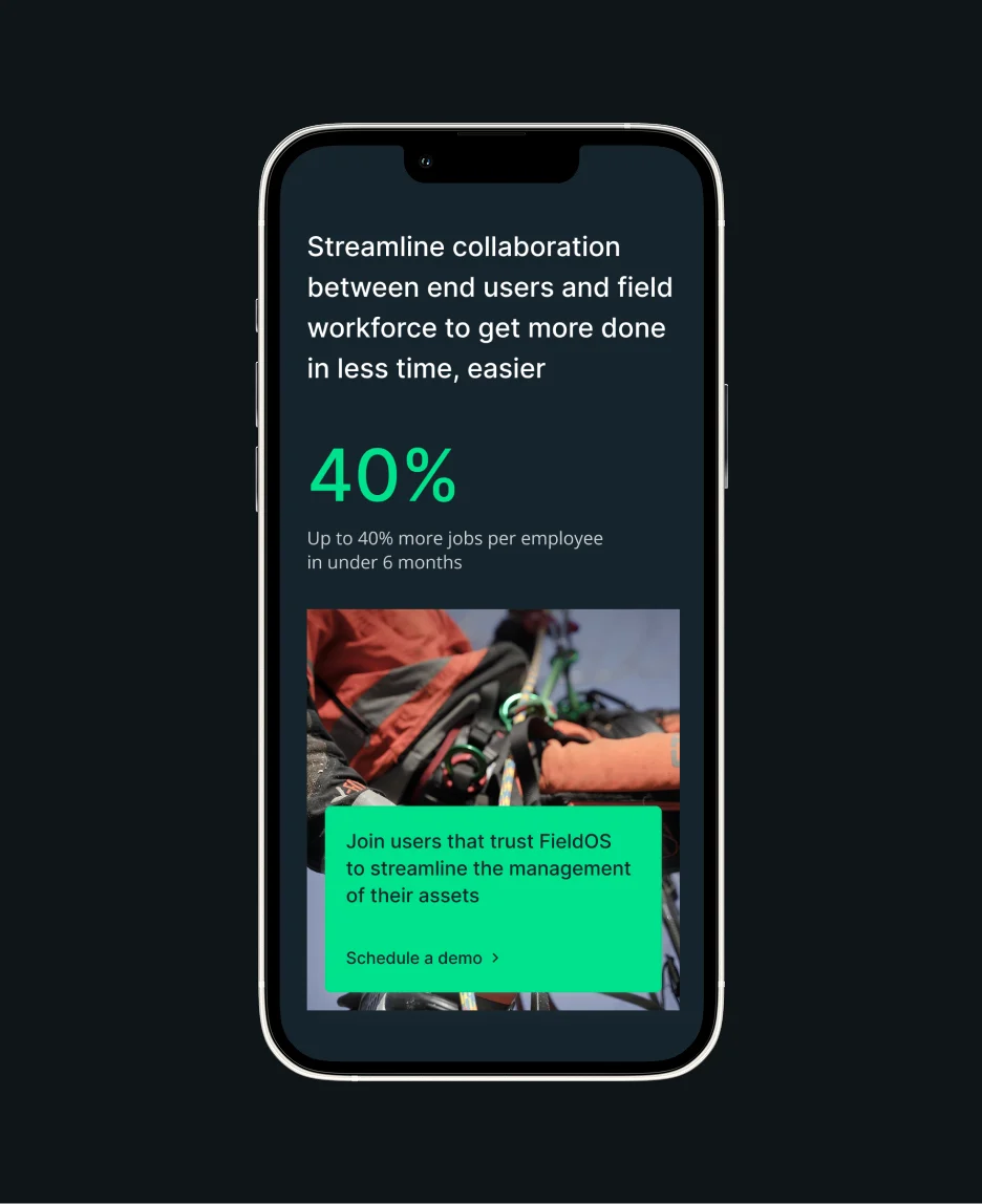
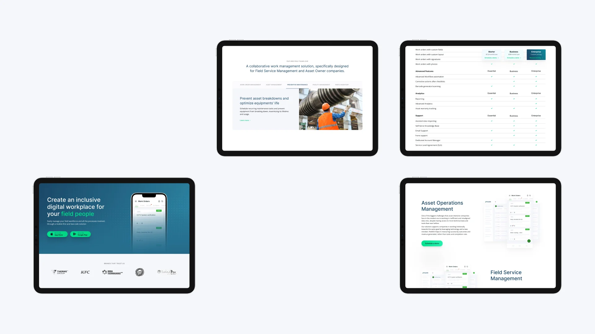
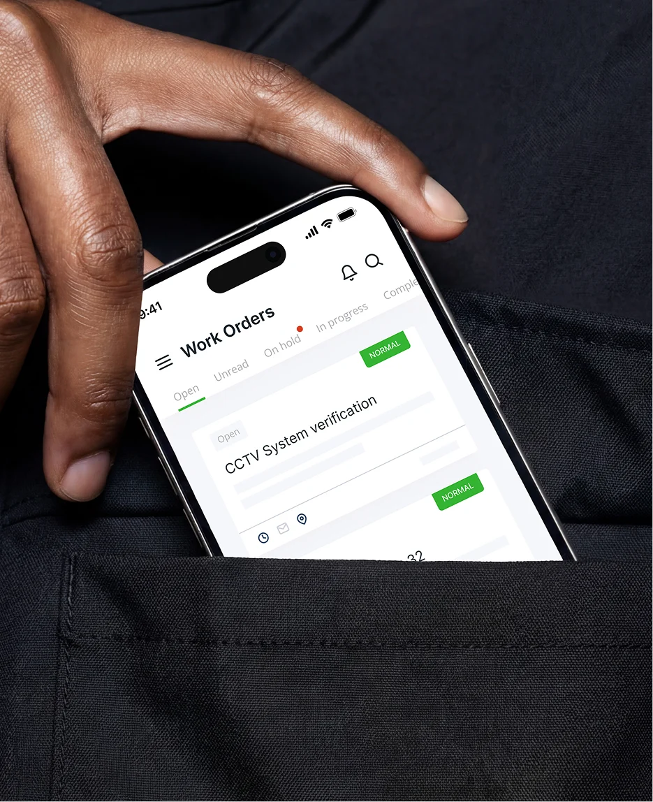
They had a strong product trusted by enterprise teams in manufacturing, energy, and utilities, but the brand didn’t match it. The platform delivered real results (40% more jobs per employee in under six months), yet the logo was outdated, the website led with features instead of value and there were no brand guidelines to hold it all together.
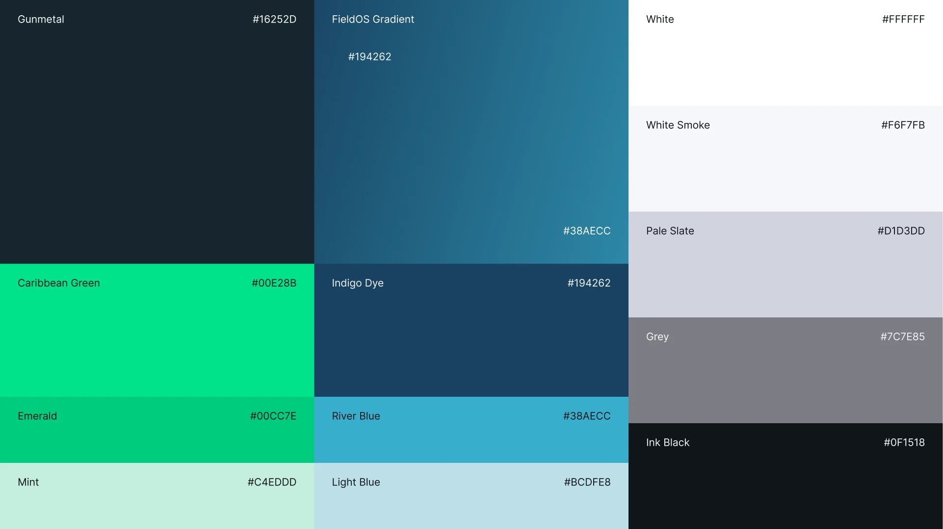
Together, we built a complete visual identity centered on three traits FieldOS actually embodies: reliable, professional, intelligent. New logo, color system, a full brand guidelines document and a website rebuilt around the enterprise buyer journey. End goal: a brand that wins trust before any sales conversation starts.
- Brand Identity, UI/UX Design, Web Development
The context
Enterprise software buyers don’t read, they scan for proof. In asset-intensive industries like manufacturing and energy, the wrong platform choice is costly. They need to know immediately that a vendor understands their world.
FieldOS had the proof. Teams across multiple sectors relied on the platform daily. But a dated logo, inconsistent visuals and a feature-first website left buyers doing the work themselves. The brand needed to do it for them.
A serious platform, a generic first impression
FieldOS had evolved into a comprehensive Asset Operations Management platform covering maintenance management (CMMS), enterprise asset management (EAM) and collaborative work management (CWM) across six industries. But none of that came through in how the brand looked or felt.
The logo felt generic. Nothing in it communicated technical depth or the reliability that asset-intensive operations demand. The website led with features and left the business impact implied. With no brand guidelines in place, every new asset drifted further from a coherent identity. Competitors with weaker products looked more credible simply because they looked more intentional.
Built on what the company actually was
We started with strategy, not design. We mapped FieldOS’s brand personality, target audience and the real reasons customers chose them over alternatives. Three traits defined the brand foundation: reliable, professional and intelligent
The logo uses clean geometry and a deliberate two-color system — primary green for growth and security, secondary blue for trust and expertise. Minimal enough to hold at favicon scale, distinctive enough to own in a competitive market.
The brand guidelines gave the team a consistent reference across every touchpoint. Color rules, typography hierarchy, logo usage, tone of voice, so the brand stays coherent whether it’s a pitch deck or a product screen.
The website was restructured around the buyer journey, leading with business outcomes rather than features. Clean, fully responsive, and built to let enterprise buyers self-qualify.
From field service tool to enterprise platform
The new identity positions FieldOS as the professional, reliable partner that asset-intensive teams in manufacturing, energy, utilities, and beyond want to work with — not just a feature set, but a company that understands their operational world.