Skip to content

Brand redesign and website update for FieldOS

fiedl-os-logo

type of work

Logo design, Brand Guidelines, UI Design

date

08 April 2025

Context

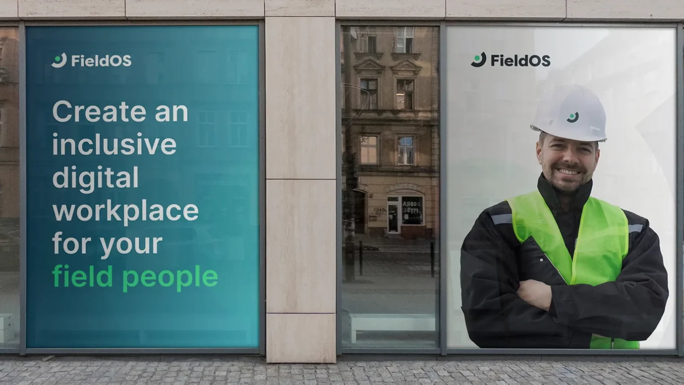
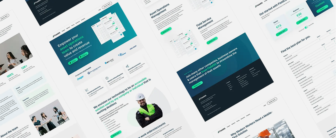
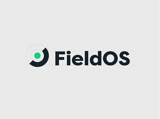
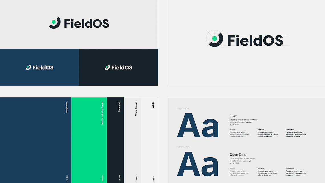
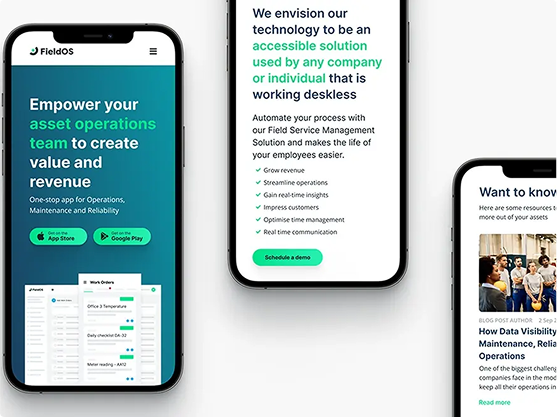
FieldOS, a top asset management platform for enterprise clients in manufacturing, energy, and utilities, asked us to refresh their logo and website. They wanted a modern, professional identity that reflected reliability and intelligence while ensuring a user-friendly site that highlights their expertise in innovative asset management.

image (18)

The Challenge

FieldOS had grown, but their logo and website hadn’t kept up. They needed a fresh look that matched their vision and strong presence in the market.

The challenge? Designing a modern, simple logo that still felt as trustworthy as ever. Plus, their website needed a revamp, something that not only looked great but also made it easy for visitors to see what FieldOS does best: smart, reliable asset management.

image (19)
image (20)

The Solution

We made three logo options, each capturing their core values of reliability, professionalism, and intelligence. 

They chose a sleek, modern design with clean lines and a fresh color palette - primary green for growth and security, and secondary blue for trust and professionalism. 

The final result was a minimal, adaptable logo that reflects their commitment to transparency and user-friendly solutions. 

For the website, we carried over the updated branding to create a clean, intuitive experience. The new design is modern, easy to navigate, and fully responsive, making it effortless for enterprise clients to explore FieldOS's collaborative asset management solutions. 

image (21)
image (22)
image (23)
image 45

The Results

The new visual identity is versatile, ensuring the Starfish presents a consistent, recognizable face across all touchpoints, from digital media to physical events. This refresh positions Starfish as a forward-thinking, expert provider of corporate team experiences, ready to meet the challenges and opportunities of 2023 and beyond.