If you are a designer or digital marketer trying to learn what graphic & web design trends will help you stand out in front of your audience, you are in the right place.
This article is meant to help you figure out what new and contemporary trends may become significant in 2021 and beyond, so you can push the boundaries & elevate your work:
- 3D design
- Illustrations
- Typography Design
- Geometric Shapes
- Colors on White Surfaces
- Organic design
- Color…less Design
- Glassmorphism
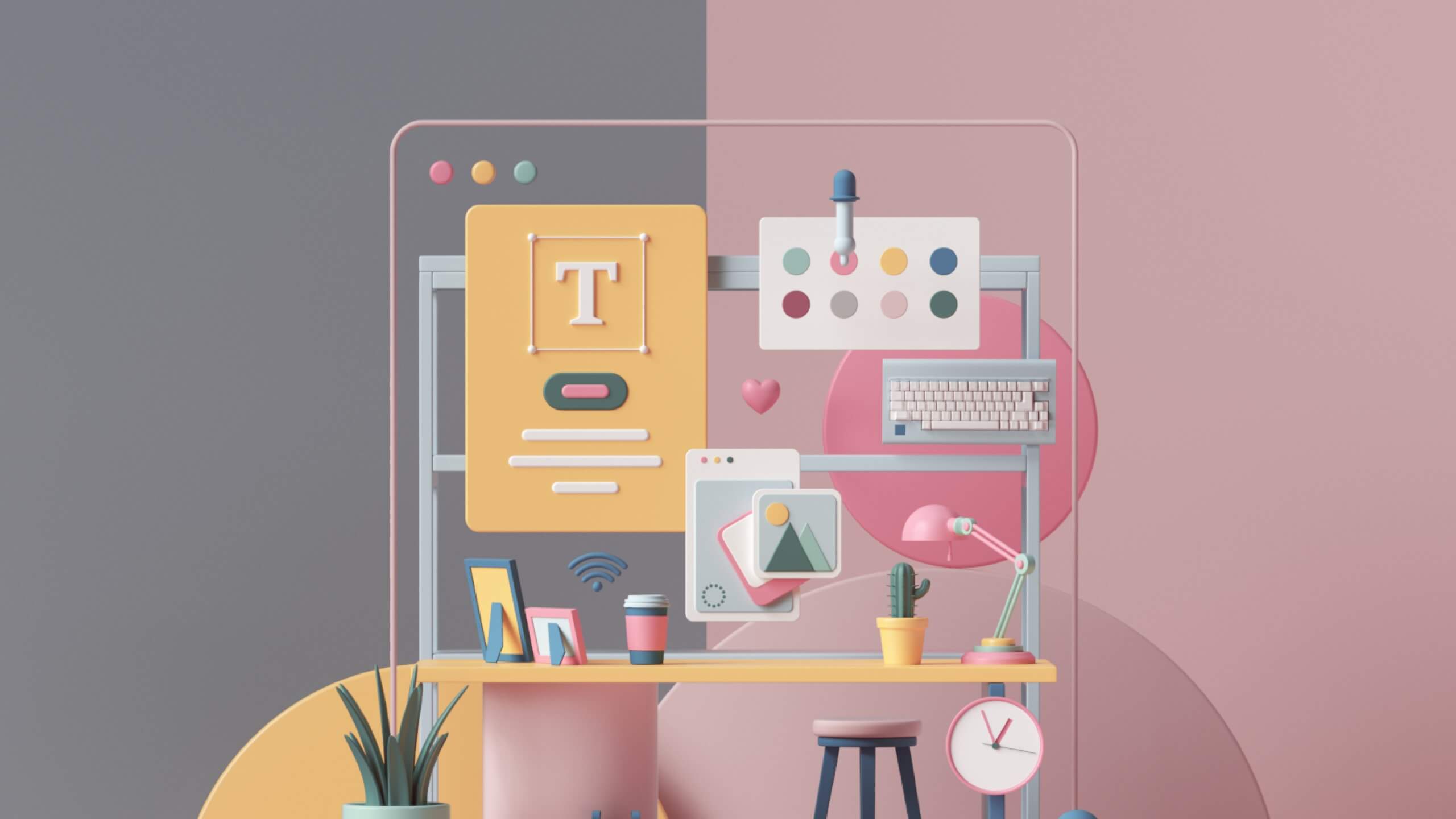
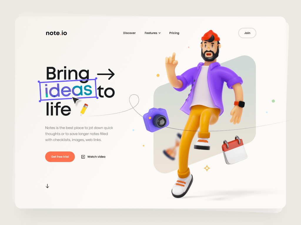
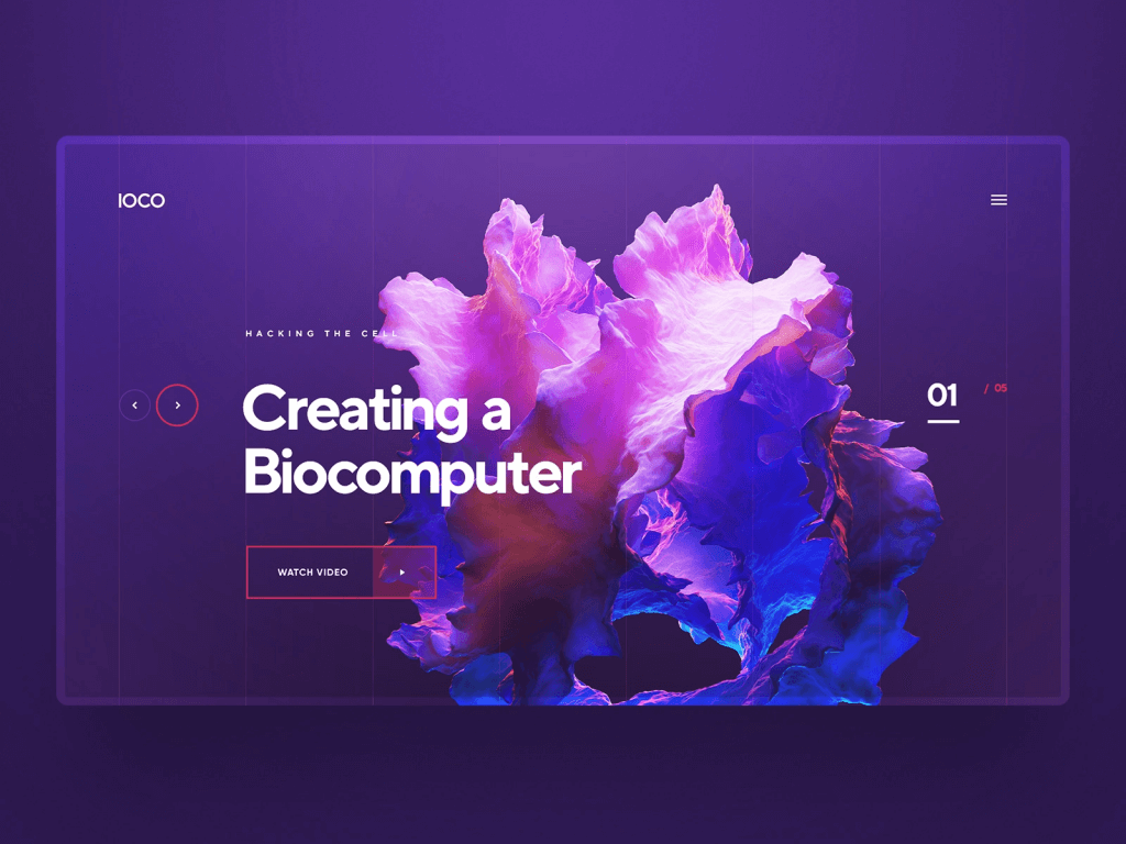
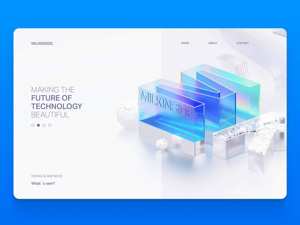
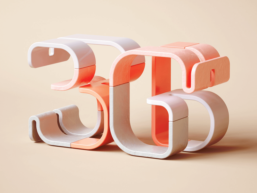
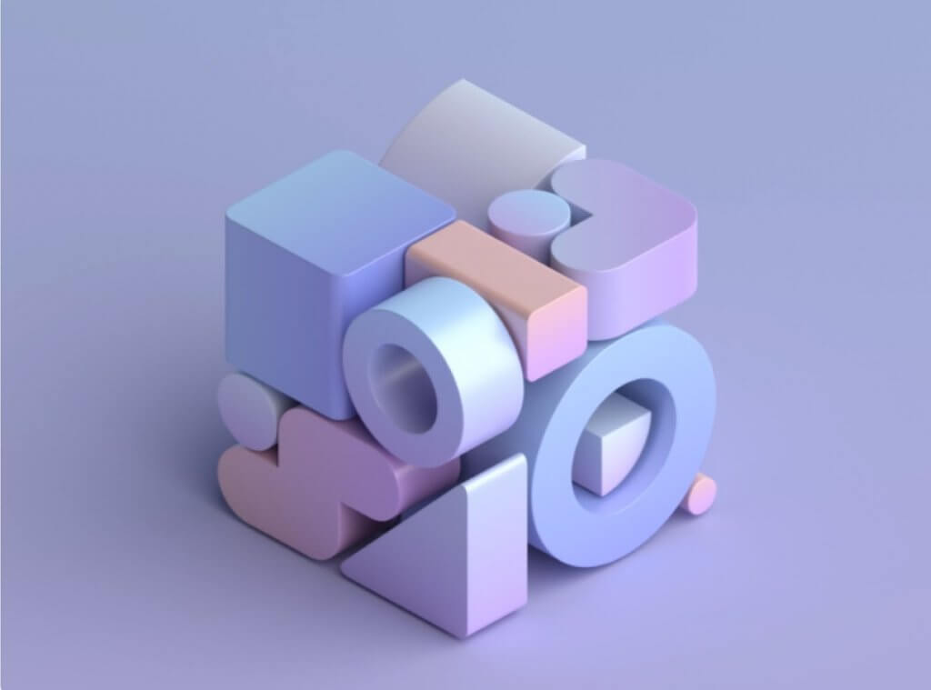
1. 3D design
3D is a dominating trend of 2021, and we are seeing the transition from flat design more and more. It’s not exactly new, but it’s getting more attention, by adding depth and a touch of reality to our online experiences.
To stand out, designers are combining 3D objects with photo images, illustrations, 2D designs, and typography.
Adding movement with animation, holding the attention, and engaging the viewer is another use of the 3d-like effect – it’s called Parallex motion. The technique requires the background of a website to move at a slower rate than the foreground while scrolling, creating depth and captivation. We can say it is an optical illusion and has equal parts of real and surreal.
If you want to get started with surreal 3D abstractions, Spline, Blender, or Cinema4D are a good start for entering the world of 3D visualization.
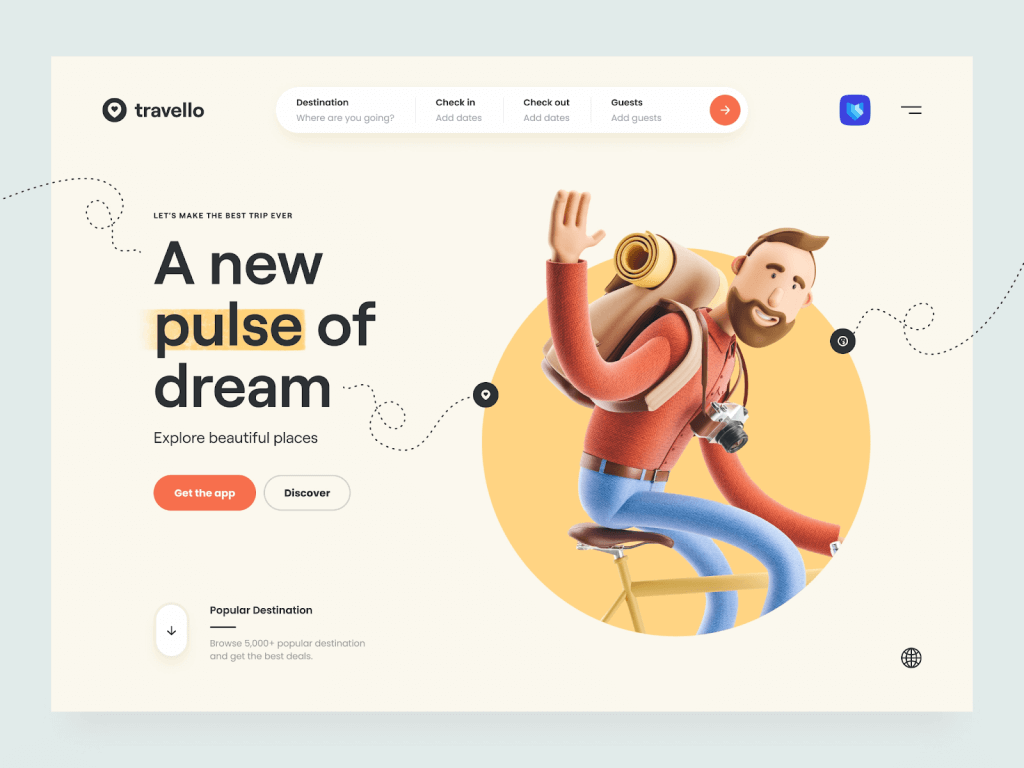
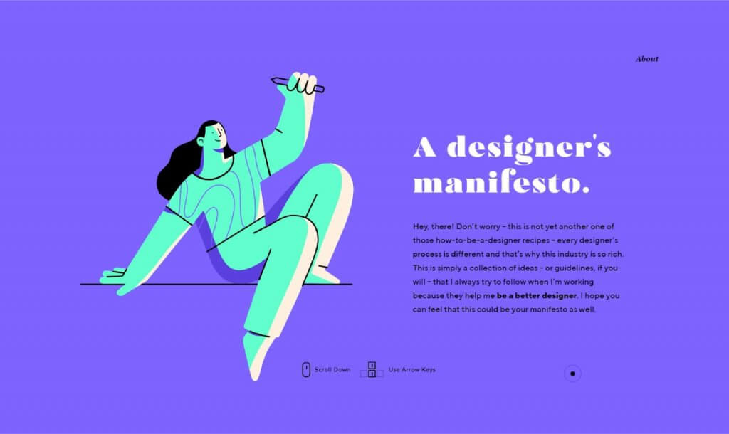
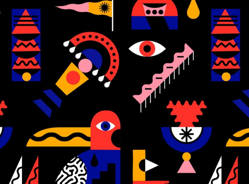
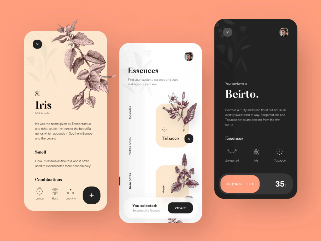
2. Illustrations
Here is a trend that is not going to fall off the radar anytime soon. The idea of custom illustrations has become an effective way of getting your design to stand out.
Variating from 2D (that dominated last year), 3D, 70’s & 80’s cartoons inspired illustrations to overlapping crazy shapes & colors, they are incredibly flexible, multifunctional, and wildly stylish.
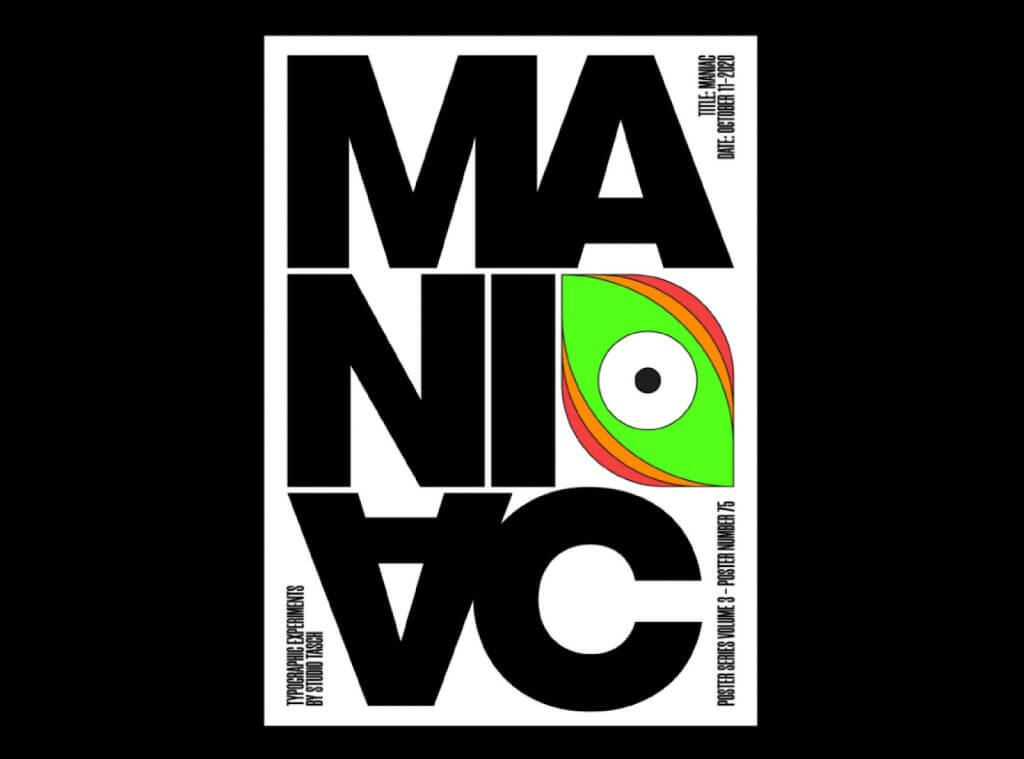
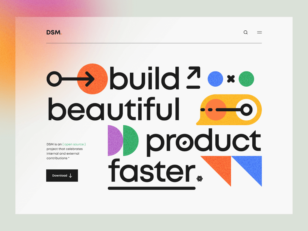
3.Typography Design
Typography design has this artistic flow, that makes you see that something as simple as a typeface can become this bundle of playful ideas and concepts. This trend is rapidly becoming a symbol of innovation, either geometric or organic, and looks like is beginning in 2021 with:
3d Typography
The prediction for 2021 is that the classic typography will be reshaped into 3D. The ultra-realistic lettering that feels like you can reach in and touch it, will become a visual representation alongside animations, textures, and patterns.
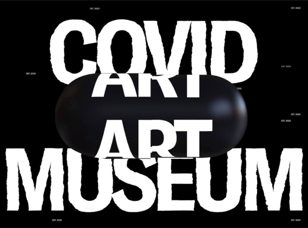
Typography Chaos
As if there wasn’t already enough chaos around the world, this trend will take 2021 by storm. The only rules are the ones that are to be broken, any way you choose.
The lack of text and letter alignment, mixing the order of letters and words, strong contrasts, big and sophisticated typeface. The main idea behind it is a deconstruction of what we perceive as beautiful and useful. Here is a good exemple: Synchronized
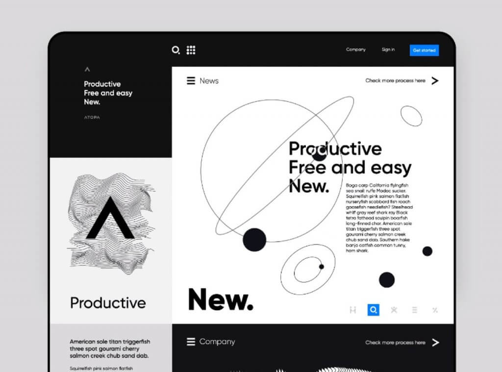
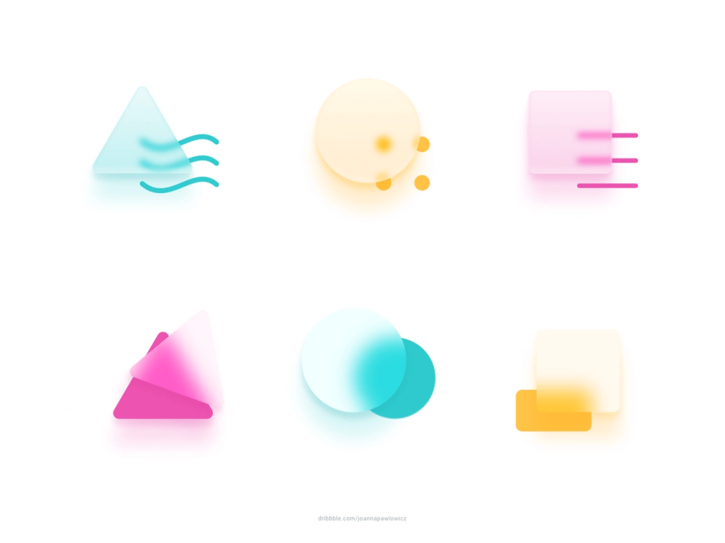
4. Geometric Shapes
This design trend is something we’ve noticed coming for a while but looks all set to peak in 2021. It takes us back to basics, the fundamentals of the Bauhaus design, but at the same time moves us forward with these simple, harmonious forms.
The idea of using individual shapes to create larger more complex ones (often mixed to create a mosaic), with strong colors and outlines, and managing to mix the simplicity of block design with the depth, shadow, and gradient effects of 3D, it’s something to look out for in 2021.
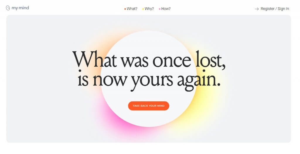
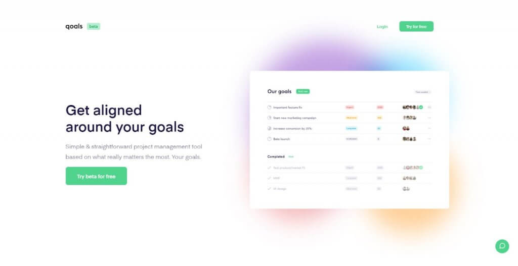
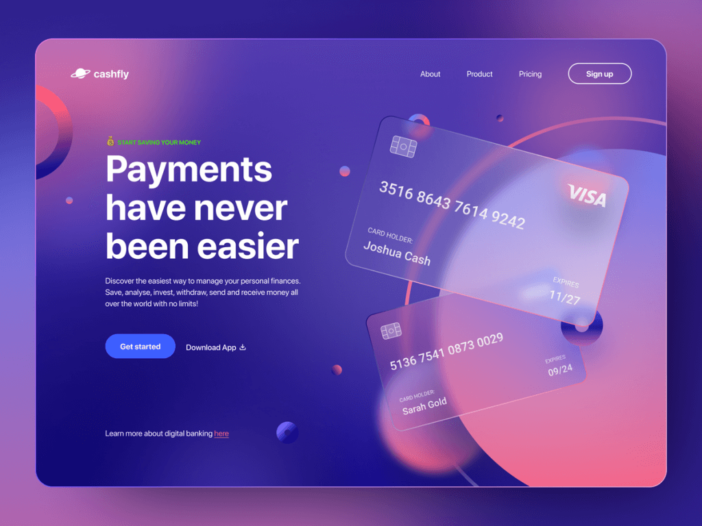
5. Colors on White Surfaces
Colors are one of the most important visual elements in a design. They can highlight your content and help you distinguish elements and surfaces from one another, and it’s easier to differentiate and remember a product. Instagram knew that a long time ago (and that explains their unforgettable icon).
Color schemes have been gravitating towards gradients and realism for a while now. So combining more than two colors to create a colorful blurry background is becoming a thing!
For more depth, in 2021 the shadows get more complex, revolving around color, which differentiates the hierarchy between content. The effect is often very subtle but at the same time looks incredibly organic, warm, and welcoming.
If you want websites that can generate beautiful and vibrant color pallets, here are some ideas: color.adobe.com, colorsupplyyy.com/app/ or brandcolors.net/

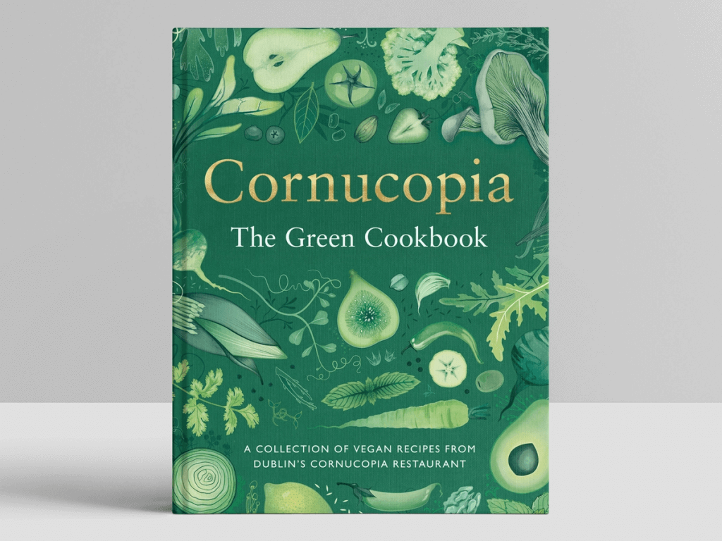
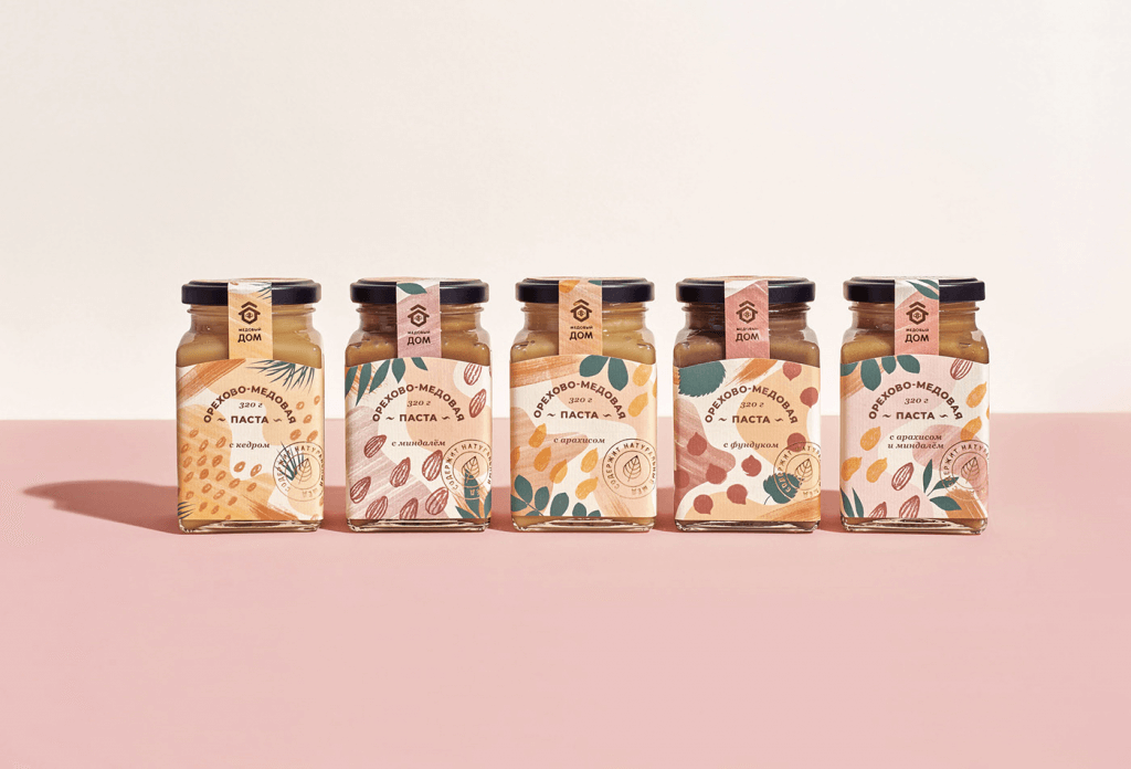
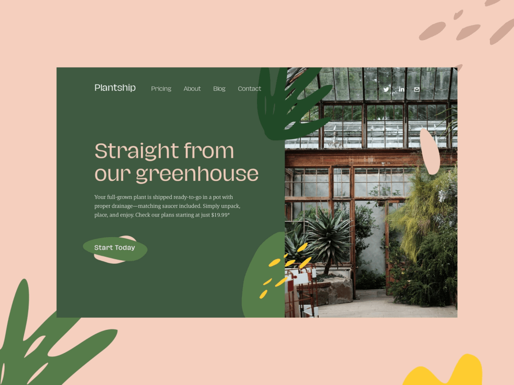
6. Organic design
All around the world, people are starting to commit to sustainability.
This nature-inspired trend that started a few years ago is set to strengthen in 2021 and is all about mimicking nature, organic textures, natural lights and shapes – leaves, trees and flowers, botanicals, and neutral, softer, earthy color tones. Neutral colors are an effective way to add a natural feel to your design and are ideal for designers who want to get back to basics.
One current theory is that following the lockdown of 2020, people became more attracted to visuals that reflect the outdoors, and the essential qualities that nature has to offer.
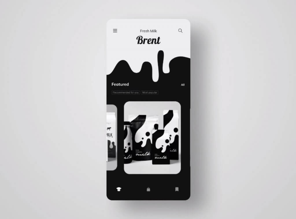
7. Color…less Design
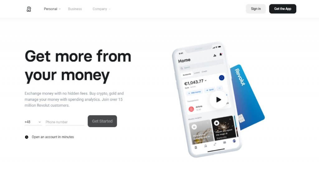
In a multicolored world, where bright, bold clashing colors are one of the obvious ways of attracting attention, this trend takes another approach – a simpler, more comforting way. People are in search of simplicity, a calm and solid ground, that they’ll find in the classic black and white effect.
Softer on the eyes and with minimal highlight colors too, it offers something different that feels mysterious and new, so I know I am a fan. Websites like Revolut are the perfect example that a minimal and readable UI is also pleasingly aesthetic.
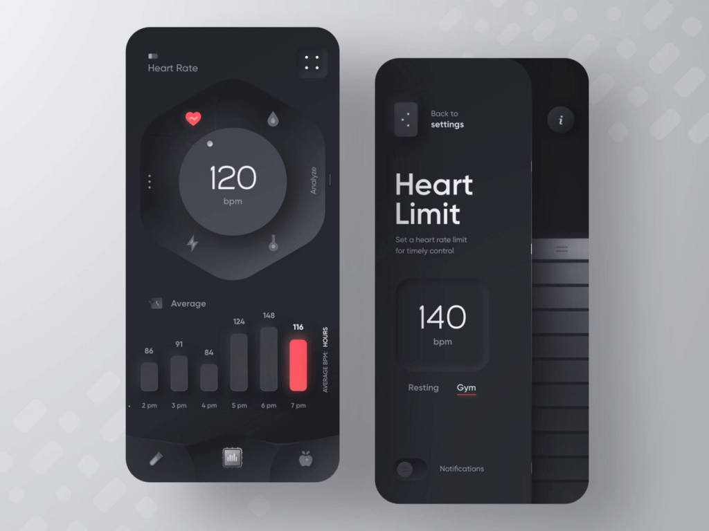
I’ve seen more and more dark mode designs, especially as a supplemental mode that can be used to display surfaces on the UI. A good example can be the alternative dark theme for applications. It’s a functional way of engaging the user by giving him this option, where he can switch during specific times, like nighttime. While it enhances visual ergonomics by reducing eye strain, big pieces of content can become more challenging because the text begins to appear washed out.
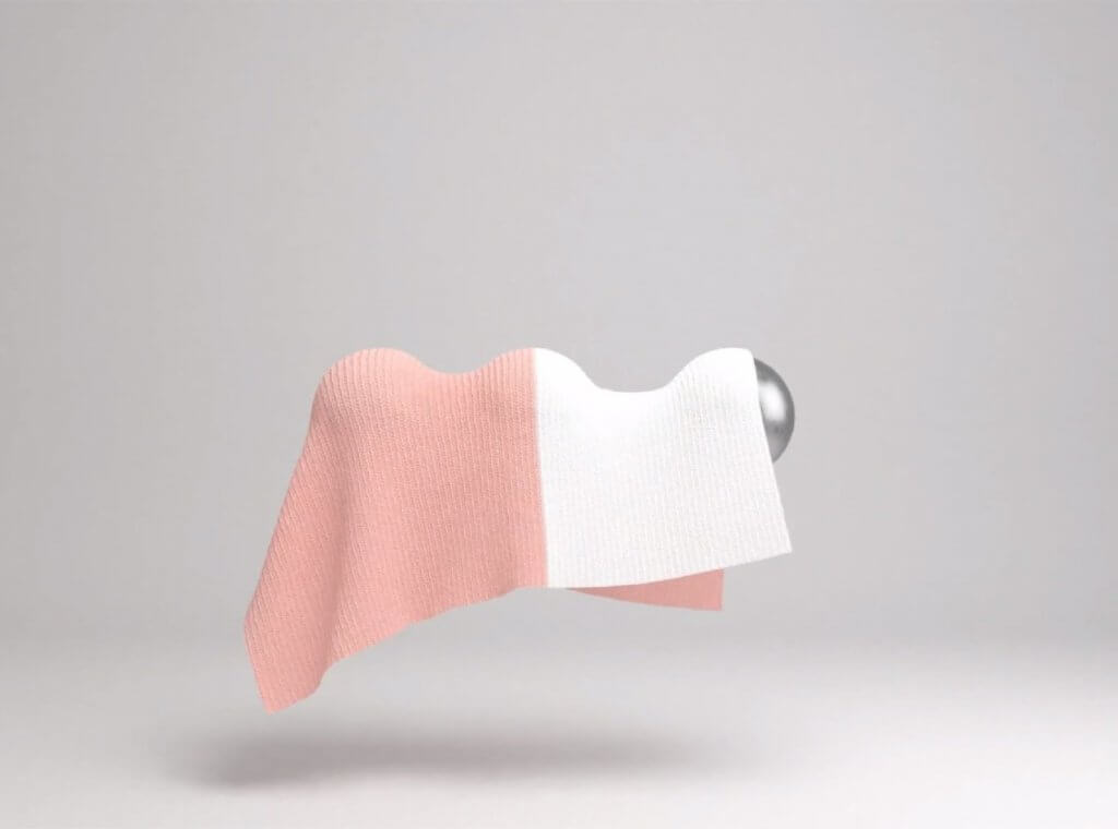
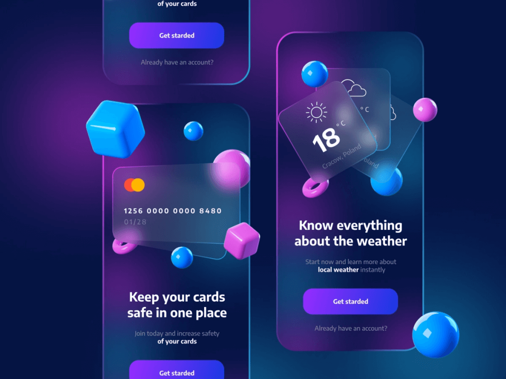
8. Glassmorphism
From neuomorphism to glassmorphism. It’s based on a background blur effect, and it basically creates that “through the glass” look and feel on elements.
It was introduced in Windows Vista and it seems it’s here to stay for a bit. It’s not a new trend, but its use is nowadays more often, and let’s just be honest, it looks really good.
If you want to take a closer look at glassmorphism to make an idea, try this Glassmorphism Generator online tool.
To conclude
Regardless of your industry, you’ll want to follow the golden rules: make it easy to use, aesthetically pleasing, and include all the relevant information needed to tell your story.
From crazy energetic color illustration, surreal 3D abstractions, and chaos typography to natural colores, clean and morphism. Soft, positive, and friendly visuals will replace the familiar clinical-looking ones.
I think if you find the trend that will help you push the boundaries and elevate your work, everything will fall into place. You need to experiment to see what fits you and find that spark.